
The Conductor Came to see ME?
Published:
There’s an old joke about a violist who suffers weekly at the hands of his conductor during rehearsals. The conductor humiliates him by pointing out his every mistake to the rest of the orchestra, and the violist starts to think he can never do anything right.
One day, the violist comes home and finds fire engines and police cars parked around his still-burning house. He asks what happened. A policeman tells him that his conductor came by to see him, but didn’t find him home, so in a fit of rage the conductor shot his wife and his kids, and set his house on fire. The violist delightedly cries, “the conductor came to see ME?!”
A Conductor’s Life
The principal conductor, sometimes referred to as a music director, determines the culture of an ensemble. And jokes about hapless violists aside, the best conductors can inspire an immense amount of respect and loyalty in their orchestras.
Interestingly, orchestra conductors are spending longer and longer in their role. In a sample of 96 U.S. symphony orchestras, conductors who left their position between 1920 and 1970 spent an average of 6.4 years in the position, while those departing from 1970 to 2020 had clocked in 10.5 years.
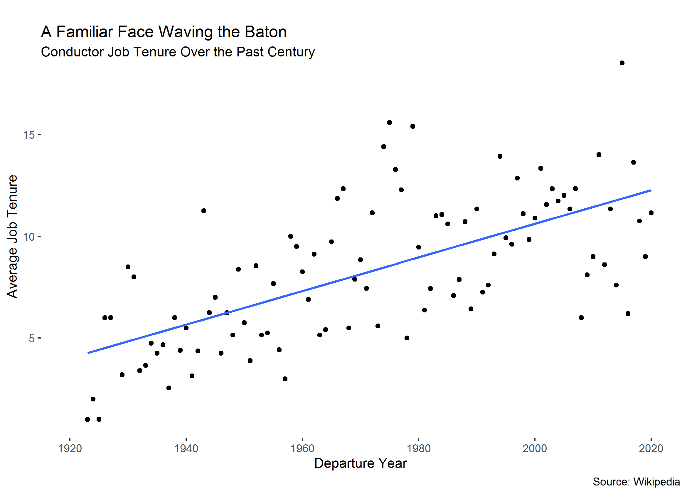
It’s not clear whether this trend is because the nature of the position has changed, or whether broader social and demographic forces have aligned to reduce churn in this labor market.
Code
rm(list = ls())
pacman::p_load(data.table, ggplot2)
setwd("PATH")

dt <- readRDS("INPUT")

l <- dt[year_start >= 1920, .(avg_tenure = mean(tenure)),
  by=(year_end)]
l <- l[order(year_end)]

gg <- ggplot(l, aes(x=year_end, y=avg_tenure)) +
  geom_point() +
  geom_smooth(method='lm', se=F) +
  labs(title = "A Familiar Face Waving the Baton",
       subtitle = "Conductor Job Tenure Over the Past Century",
       y = "Average Job Tenure",
       x = "Departure Year",
       caption = "Source: Wikipedia") +
  theme(plot.title = element_text(margin = margin(t=15, b=-20)),
        plot.subtitle = element_text(margin = margin(t=25, b=-20)),
        panel.background = element_blank()) +
  scale_x_continuous(limits=c(1920, 2020),
                     breaks = c(1920, 1940,1960, 1980, 2000, 2020))
plot(gg)

ggsave("OUTPUT")